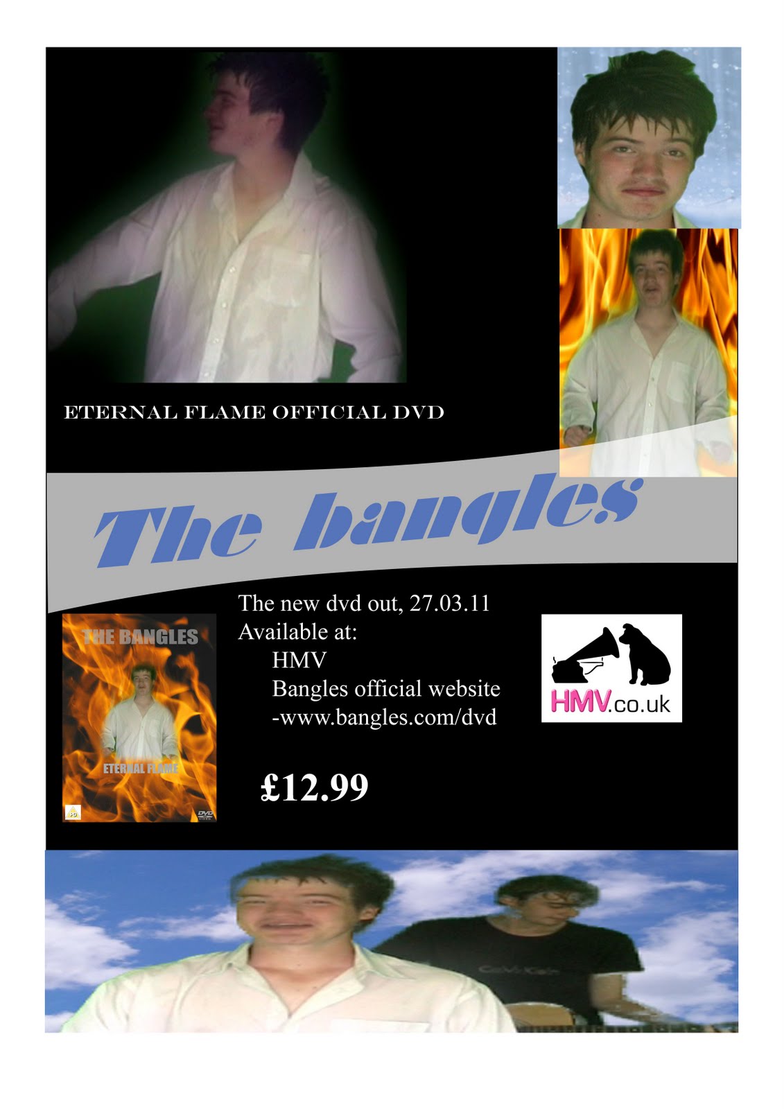
Our magazine article is a black background with shots of the video on it; the black was chosen so as the pictures stand out and draw the eye to it as fans of the group will see them and be attracted. We included still shots from the music video so as people who enjoyed the video would see it and be attracted to it as they would want to know what else was happening to do with it. We used a banner-type title so as the advert looked like an unavailing of something important and put the name of the band THE BANGLES in capitals and bright blue to draw eyes directly to it. We included all the useful information necessary in an advert without a huge block of text as we thought that a great deal of writing would repel readers and put them off looking at the article; by breaking the information down into need-to-know points people would more easily take in the information without having to try. We also included a band logo of HMV so as people that could not be bovered to read the article at all would see the logo and therefore associate it with the place at which they could buy the product. We used an easy-to-read font for the majority of the writing so as it would be easily consumed and also put the price of the DVD in bold so as it stood out.
No comments:
Post a Comment